
I start off all acrylic paintings with an underpainting (the initial layer of paint applied to the surface), to get rid of the stark white of the canvas or canvas paper and to form a base layer as a foundation for the rest of the painting. Depending on the subject matter, I will also start to block-in basic tones and shapes, and almost draw in the composition with a brush at the underpainting stage too. As the paint used is thin it drips, it splashes and overall it is not pretty to look at… but there’s no need at this stage for it to be pretty! An underpainting is intended to be painted over and not seen in the final painting, however, many painters will let parts of an underpainting show through, which can be very effective if you use a contrasting hue for your underpainting – a colour that contrasts with the dominant colour of the scene. For example, using a burnt sienna for the underpainting of a painting that is going to be predominantly green. I have used harmonising and contrasting monochromatic underpainting, depending on the effect I’m trying to achieve, but I don’t have one colour I always use, which some painters do. I’ll often decide on the colour I will use when I start. The darkest underpainting colour I’ve used is a mix of blue and brown (to achieve a warm grey) but I’ve never tried painting a landscape over a solid layer of black, so I thought I’d give it a try with a piece of canvas paper that I had previously painted black (for a reason I can’t really remember). I chose a view over some fields in Cambridgeshire, near Ely, on canvas paper.

I masked off the black background and extended the black solid underpainting for the landscape. After a couple of layers of black and making sure it was thoroughly dry, I made a start…


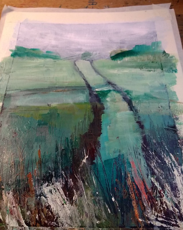

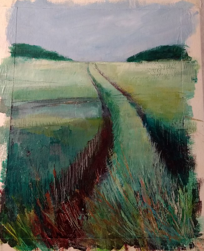

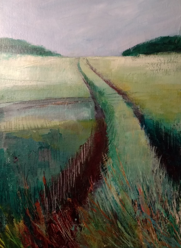
At the start I did not hold out much hope for this painting and simultaneously started painting a similar landscape on the blue background too… but by the end I was very pleased with the results. I may have to dry a black underpainting again!

Gillian, your exploration of using a black solid underpainting in landscape painting is both insightful and inspiring. In New Zealand’s painting industry, we’ve observed a similar trend where professionals are increasingly adopting dark primers or base coats. This approach not only enhances the depth and richness of the final colors but also ensures better coverage, especially when working with vibrant or lighter topcoats. While it might require more paint initially, the end result is a more durable and visually striking finish. It’s fascinating to see how techniques from fine art are influencing and improving practices in house painting.
LikeLike